It’s not all white
Trends come and go, but a neutral colour scheme is arguably the most enduring. Whether it’s shades of white or soft beiges or greys, going neutral will add style and value to your home.
Neutral colour schemes are considered a calming, restful retreat from the busyness of modern life. Home owners can also add bold feature walls, artworks and colourful accessories to compliment neutral colour tones without clashing or being too overwhelming.
However, don’t be tricked into thinking that all beiges and whites are the same. Even the most subtle shade of difference can dramatically alter the colour – and let’s not forget the huge impact that sunlight has. Adding other colours to accompany your neutral walls can also throw an unintended hue. Lets face it, choosing the right white can be quite overwhelming!
One of the biggest things to help you make your choice is if you understand the essential difference between warm whites and cool whites, and the undertones that create them. Really, you only need to see the starkly difference of the light that Warm White globes and Cool White globes shed to appreciate they’re worlds apart – and how each one affects the ambience of the room. When it comes to white paint colours, it’s all down to the underlying pigments.
Cool Whites
Cool whites have a blue or black base and work well in rooms that get a lot of sun, as they can handle the bright sunlight. It’s often the choice for a cool, minimalist aesthetic, where maybe the architecture, artworks or furnishings are the heroes. Think modern warehouses or loft apartments.
Warm Whites
Warm whites have yellow, red or brown undertones, which give them more earthy and less austere tones. They make a room feel cosy. They’re generally well suited to older spaces with period character. That means the neutral scheme you use for a coastal style interior will be vastly different to what works in an urban industrial-style apartment.
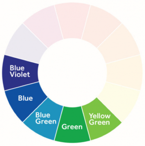
Cool colour schemes consist of various shades of blue, green and purple.
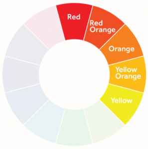
Warm colour schemes are shown in this colour wheel, taking in red through to yellow.
Earthy Tones
For neutrals, warmer brown and green tones work well in most spaces, as they are earthy tones and complement natural materials such as timber and stone. Be careful with colours that have blue tones in them. Remember, blue can make a room feel cold, so they need a lot of light and space to breathe.
Quick Tips
- Always use a generous test swatch, either on the wall or a large sheet of cardboard.
- Ensure you look at the painted swatches in the morning, the afternoon and at night to see how the colour changes under different light conditions.
- The colour globe you use will have an equally dramatic impact on the shade of neutral you choose.
- Early to mid-morning sunlight tends to have slightly blue tones, while afternoon to sunset is usually a lot warmer in tone. In direct sunlight, a colour will always look 2-3 shades lighter than it will indoors in artificial light.
CSB Homes have been turning houses into beautiful and striking spaces for decades. Our team in the Colour Studio love guiding new home owners to make the best aesthetic decisions that are not only going to make you feel proud and comfortable in your home, but will give you long term benefits for if and when you want to sell.
Call us today on (02) 9608 3333 to book in a time to chat to our team about the best options for your home.